Snap Unfold
Founding memberTurn screenshots and web pages into knowledge cards and actionable next step
snapunfold.online ↗Snap Unfold turns the website itself into a scrapbook of vibes: beautiful cards, one button, and absolutely no pricing, docs, or explanation of what happens after the snap.
Verdict of the median judge. Aimed at the site, never the founder.
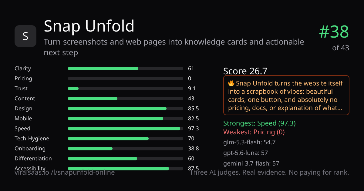
Categories (median of 3 judges)
Judges
What the median judge saw
Clarity — “Snap your moments” is memorable, but the clearer promise—turning screenshots into knowledge cards and next steps—is only in the submitted tagline.
Pricing — No pricing page was found; there are no prices, currency, billing terms, free tier, or cancellation details.
Trust — The page shows no company, team, customer logos, testimonials, case studies, security page, or dated blog; even privacy/terms links are absent from measured links.
Content — “本地优先 / 离线可用 / 无需登录” gives concrete benefits, but there are no numbered claims, FAQ, docs, or concrete use-case stories.
Design — The cream dotted canvas, green CTA, collage hero, generous whitespace, and clean alignment create a distinctive, coherent landing page.
Mobile — The 390px view keeps the hero, readable type, scaled artwork, and “Get Started” CTA on screen; there is no form to test on mobile.
Onboarding — “Get Started” is one click away and no sales call is shown, but there is no demo, setup sequence, SSO, time promise, or quickstart guide.
Differentiation — “本地优先、离线可用、无需登录” is a concrete privacy-first stance, reinforced by the unusual scrapbook-like visual identity.
Accessibility — Visible copy is real text and measured contrast passes 100%, but the evidence does not demonstrate keyboard behavior or focus states.
Measured facts — our scripts, not the judges
Same three judges, same rubric, same evidence. Beat #38 and take the spot.
Put it on the board — $5Money never affects rank.