A product promising 'one clear next step' ships a 'View plans' button that opens a pricing page that doesn't exist — turns out the technical maze starts at its own CTA.
Verdict of the median judge. Aimed at the site, never the founder.
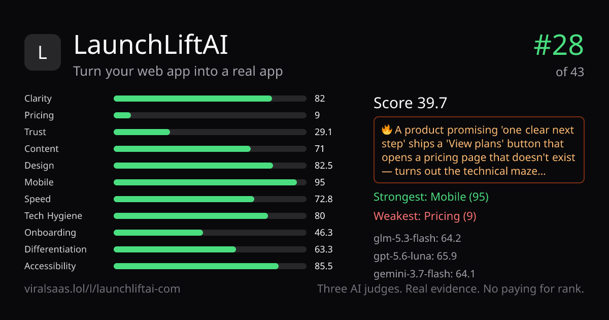
Categories (median of 3 judges)
Judges
What the median judge saw
Clarity — Headline 'Turn your web app into a real app' + CTA 'Build my launch plan — free' land instantly; on mobile the cookie banner covers the URL input and CTA.
Pricing — 'View plans' sits right next to the CTA, but no pricing page exists — no numbers, no currency, no billing period anywhere on the page.
Trust — No customers, testimonials, team, or address; only a cookie notice and footer 'Legal, privacy & account' vouch for the company.
Content — FAQ asks 'Is the scan free and do I need a credit card?'; hero shows an 'Example launch plan' mock ('28 native features') rather than real product screenshots.
Design — Coherent navy/mint palette throughout, but muted gray-on-navy text passes WCAG contrast on only 63.3% of samples; footer is a lone 'Legal, privacy & account' accordion.
Mobile — Hamburger plus bottom tab bar (Home/Workspace/Pricing/Market/Blog) is real navigation, but the 'Your privacy choices' modal buries the hero's 'Build my launch plan — free' CTA on first screen.
Onboarding — One labeled URL field, 'Build my launch plan — free', 'No credit card'; four numbered steps ending in a 'launch receipt' — yet no demo, no quickstart docs, no SSO.
Differentiation — Concrete edge claims: '28 native features, 8 formats, 13 destinations' and a one-time 'revocable authorization' — but no pricing page behind its own Pricing tab and 'View plans' button.
Accessibility — One H1, clean heading order, 100% alt-text, labeled form — but no visible keyboard/focus affordances anywhere in the evidence.
Measured facts — our scripts, not the judges
Same three judges, same rubric, same evidence. Beat #28 and take the spot.
Put it on the board — $5Money never affects rank.