
BidOut turns attention into an auction, then forgets to explain the checkout, refunds, pricing, or even provide a privacy policy—bold strategy for a site selling trust.
Verdict of the median judge. Aimed at the site, never the founder.
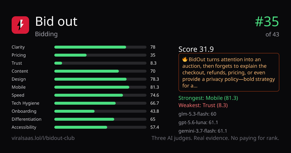
Categories (median of 3 judges)
Judges
What the median judge saw
Clarity — “Put your product, website, project or idea on the leaderboard” clearly explains the job; “place a bid” is visible above the fold.
Pricing — The page shows real bids such as “$1” and “outbid for $2,” but has no pricing page, billing period, plan comparison, or refund policy.
Trust — “Built by someone who ships” names two other projects and a social handle, but there are no company details, testimonials, security claims, or case studies.
Content — Strong concrete copy, live leaderboard data, screenshots, and a five-question FAQ; no docs or quantified performance claims are shown.
Design — Distinct black-and-red visual system, strong hierarchy, clean cards, and generous spacing; measured contrast is only 46.7% passing.
Mobile — The mobile layout is stacked cleanly with visible “PLACE A BID” CTA, readable cards, and no side-scroll; the hamburger menu is present.
Onboarding — “No login” and “place a bid” suggest low friction, but there is no demo, signup form, quickstart, SSO, or explicit getting-started steps.
Differentiation — “No login. No fake money. Just real bids.” is a memorable edge, reinforced by the stark auction-board aesthetic; no competitor comparison is provided.
Accessibility — All visible copy is text and mobile layout is sound, but keyboard behavior is unproven and measured contrast/alt-text coverage is weak.
Measured facts — our scripts, not the judges
Same three judges, same rubric, same evidence. Beat #35 and take the spot.
Put it on the board — $5Money never affects rank.